Learn how to customize the speaker widget styling through CSS.
To be covered:
- Intro
- Get started with the speaker widget.
- Basic customization using optional parameters.
- More customization options using CSS (with examples)
- More information
Intro
The speaker widget function which shows all of the speakers who are available in any event can be customized according to the event organizer's requirements by applying a CSS style function.
Get started with the speaker widget
-
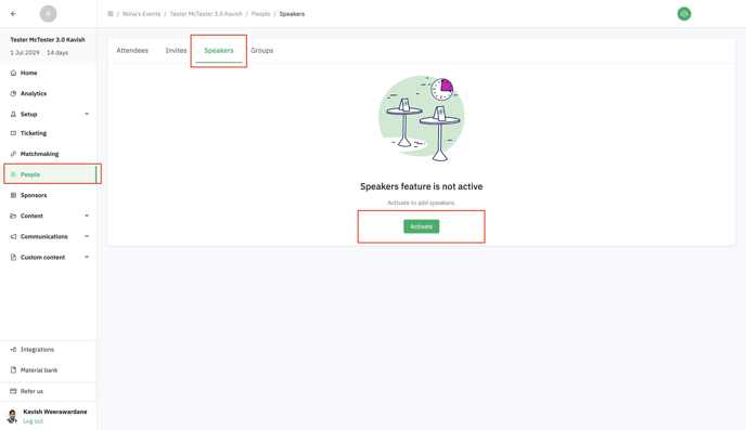
First, make sure that you have activated Brella’s "speakers" feature.
- Navigate to your event's Admin Panel and go to the 'People' tab.
- Click on the 'Speakers' section of the tab.
- Toggle the Speakers feature on.
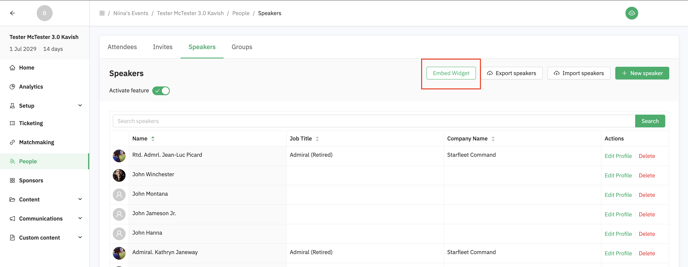
- Add some speaker profiles (test / mock speakers are fine!). This will allow you to actually see the widget update as you customize and style it.
-
Once the "Speakers" feature is active, click on the "Embed widget" button in the speakers view, and copy the code shown in the modal that opens.
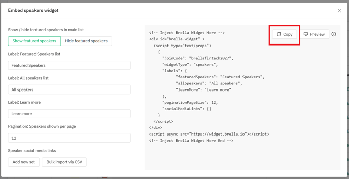
👉The copied code will look like this (the only difference will be the "join code", which will be your event's URL slug.
<!-- Inject Brella Widget Here -->
<div id="brella-widget" >
  <script type="text/props">
    {
      "joinCode": "YOUREVENTJOINCODE",
      "widgetType": "speakers",
      "labels": {
            "featuredSpeakers": "Featured Speakers",
            "allSpeakers": "All speakers",
            "learnMore": "Learn more"
      },
      "paginationPageSize": 12,
      "socialMediaLinks": {}
    }
  </script>
</div>
<script async src="https://widget.brella.io"></script>
<!-- Inject Brella Widget Here End -->
-
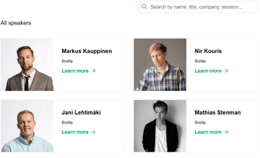
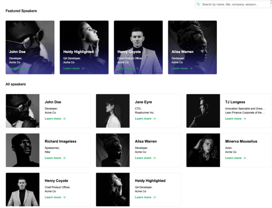
Add this code to a page on your website and the speaker widget will be visible to visitors. Any updates made to your speaker's list in Brella will automatically be reflected in the speaker's widget.
👇Result
Now that you have the basic speaker widget working, read on to learn about customizing the look, functionality, and feel of the widget using our optional parameters and CSS!
If you need additional help, please reach out to our technical support team or your customer success manager.
Basic customization using optional parameters
You can make some basic changes to how the Brella speaker widget looks on your webpage using our built-in customization parameters.
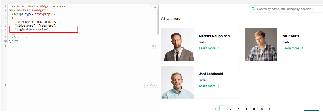
Pagination Size
👉You can control how many speakers are shown on one page of the “All Speakers” section. Simply add the following parameter to the code:
"paginationPageSize": {number}
<!-- Inject Brella Widget Here -->
<div id="brella-widget">
  <script type="text/props">
  {
    "joinCode": "youreventjoincode",
    "widgetType": "speakers",
    "paginationPageSize": 12
  }
  </script>
</div>
<script async src="https://widget.brella.io">
</script>
<!-- Inject Brella Widget Here End  -->
👇Result
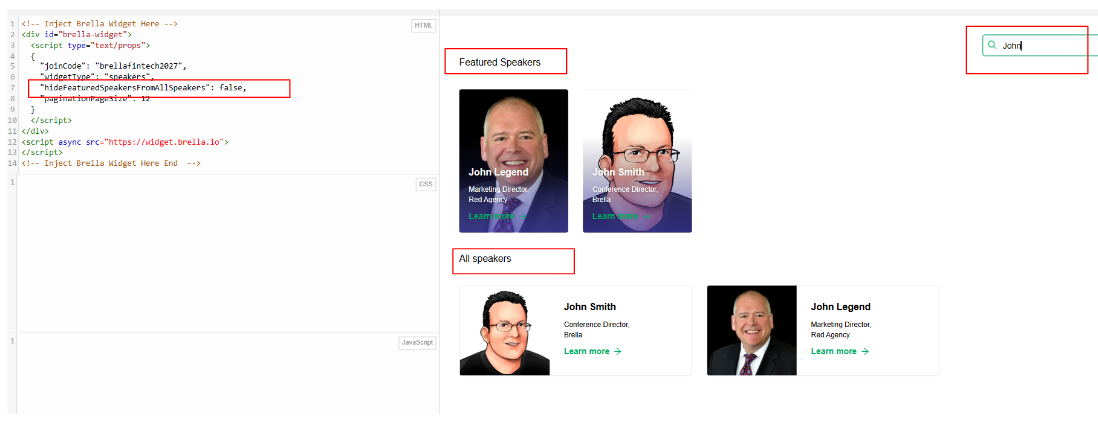
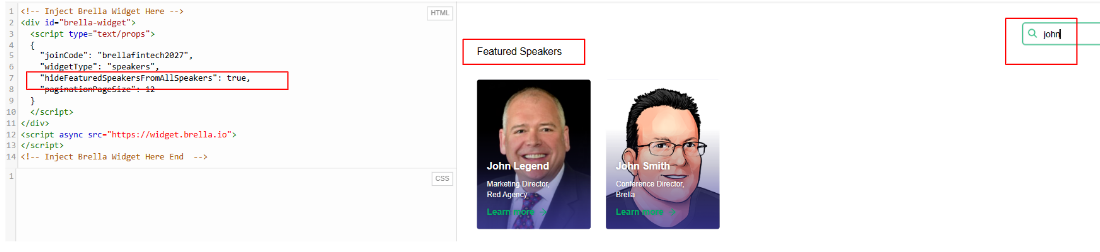
Hide “Featured Speakers” from All Speakers
👉You can exclude “Featured Speakers” from being searched when someone enters a query in the search bar — this is useful if you want to avoid repetition, or if you rename and use the “All Speakers” section as a secondary category. Simply add the following parameter to the code:
"hideFeaturedSpeakersFromAllSpeakers": true
<!-- Inject Brella Widget Here -->
<div id="brella-widget">
  <script type="text/props">
  {
    "joinCode": "youreventjoincode",
    "widgetType": "speakers",
    "hideFeaturedSpeakersFromAllSpeakers": true,
    "paginationPageSize": 12
  }
  </script>
</div>
<script async src="https://widget.brella.io">
</script>
<!-- Inject Brella Widget Here End  -->
👇Result
If, "hideFeaturedSpeakersFromAllSpeakers": false
You will see the results repeated in both featured speakers and all speakers.
If, "hideFeaturedSpeakersFromAllSpeakers": true
You will see the results only in featured speakers.
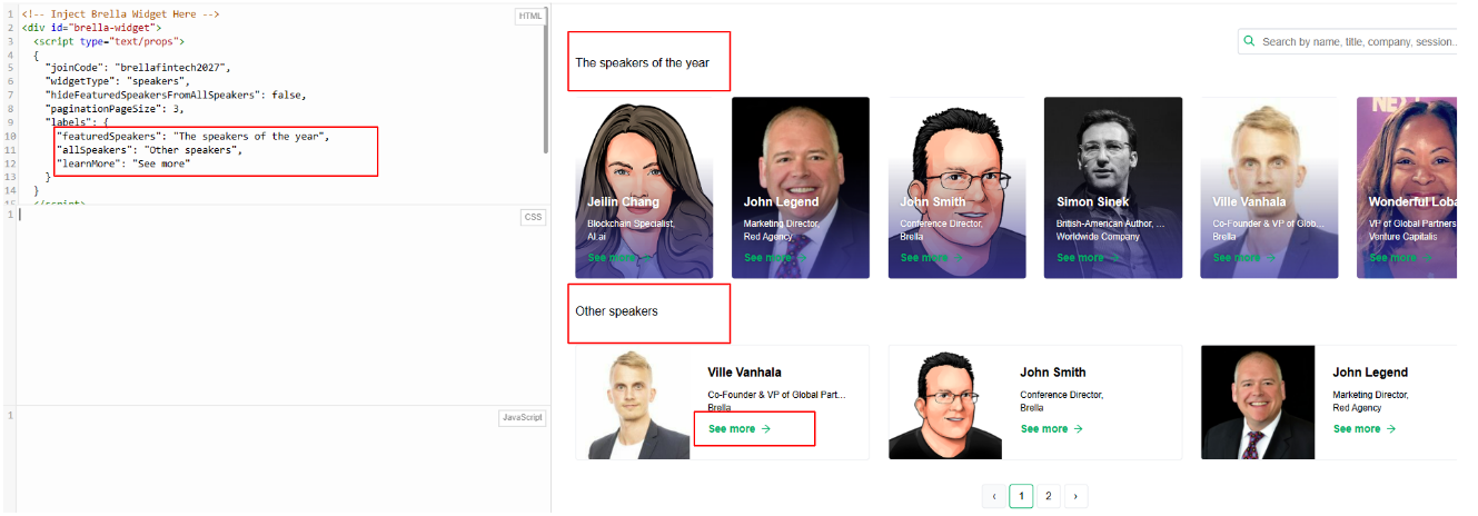
Change Labels & Button Text
👉You can easily change the main labels and button text using the labels parameter. You can change all or just a few of the above options.
"featuredSpeakers": "Custom Featured Speakers Label Text Here",
"allSpeakers": "Custom All Speakers Label Text Here",
"learnMore": "Custom Button Text Here"
<!-- Inject Brella Widget Here -->
<div id="brella-widget">
  <script type="text/props">
  {
    "joinCode": "youreventjoincode",
    "widgetType": "speakers",
    "hideFeaturedSpeakersFromAllSpeakers": true,
    "paginationPageSize": 12,
    "labels": {
      "featuredSpeakers": "The speakers of the year",
      "allSpeakers": "Other speakers",
      "learnMore": "See more"
    }
  }
  </script>
</div>
<script async src="https://widget.brella.io">
</script>
<!-- Inject Brella Widget Here End  -->
👇Result
More customization options using CSS (with examples)
👉Hiding specific sections / making the widget modular
In some cases, you may need to only show “Featured Speakers”, or perhaps omit that altogether, or perhaps you want to hide the search bar, etc. These customizations are possible through the addition of custom CSS.
Simply add the following CSS classes to your website’s styles, so they load on the page which contains the widget:
- To hide the search bar, add:
.brella-widget-speaker-toolbar { display:none; }
- To hide the pagination bar, add:
.brella-pagination { display: none; }
- To hide the “Learn more” button, add:
.brella-speaker-card-learnmore-link { display: none; }
- To hide the “Featured Speakers” section, add:
.brella-widget-highlighted-speakers { display: none; }
- To hide the “All Speakers” section, add:
.brella-widget-all-speakers { display: none; }
You can mix and match these as needed. However, if you are hiding the “All Speakers” section, we recommend also hiding the search bar — as it would be non-functional (since all of the search results are displayed in the “All Speakers” section.
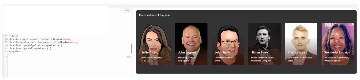
The following code would hide the search bar, the “Learn more” button, and the “Featured Speakers” section.
<style>

.brella-widget-speaker-toolbar { display:none; }

.brella-speaker-card-learnmore-link { display: none; }

.brella-widget-highlighted-speakers { display: none;  }

</style>
👇Results
👉Additional CSS Classes for Visual Styling
Use the following CSS classes to change specific aspects of the widget’s look and feel — from card sizes to border-radius to the primary and secondary colors. Add these to your website’s CSS styles.
<!-- Primary colors -->
<style>
:root {
  --brella-color-primary-600: tomato;
  --brella-widget-speaker-gradient-rgb: 75, 30, 15;
}
</style>
<!-- Card Sizes -->
<style>
:root {
  --brella-widget-min-speaker-card-width: 320px;
  --brella-widget-min-speaker-narrow-card-width: 180px;
  --brella-widget-speaker-modal-width: 750px;
  --brella-widget-border-radius: 8px;
  --brella-widget-border-radius-small: 4px;
}
</style>
👉Dark Theme / Brand
You can use the following styles to match the widget with darker themes. Edit the color of each CSS property to match your brand and theme. Add these to your website’s CSS styles.
<!-- Dark mode -->
<style>
:root {
  --brella-widget-background: #333;
  --brella-widget-secondary-background: #444;
  --brella-widget-text-color: white;
  --brella-widget-speaker-card-background: #222;
  --brella-widget-border: 1px solid #111;
  --brella-widget-input-border: 1px solid #111;
  --brella-widget-modal-background: #333;
  --brella-widget-modal-header-background: #222;
  --brella-widget-text-muted-color: #999;
  --brella-widget-speaker-tag-background: #222;
}
</style>
👇Result
More information
👉How the search works
The widget’s search function searches the first name, last name, company name, job title, and session title field for each speaker.
By default, the search will display results in both the featured and all speakers sections.
👉Troubleshooting style errors
In some cases, your widget may have odd-looking styles and other visual issues. Most often, these are caused by conflicting styles from your CMS or website. In particular, you may encounter this when using CMS’ like WordPress or Squarespace.
The best way to troubleshoot these issues is to use Google Chrome’s dev tools/inspector. Hover over the malfunctioning element (eg: a card, button, etc. in the widget), right-click there, and click on “Inspect” to open the inspector.
Then, navigate to the styles tab and see which styles are causing issues. Chrome’s inspector will also show where each style is coming from (outlined in red below). In addition to our schedule-widget.css, you may see styles applied from your website.
Identify which CSS properties are causing issues and override them by adding appropriate properties and values to the class assigned to the malfunctioning element.
👉 Maintaining consistent card & image heights
Ideally, all images in Brella should be of the same aspect ratio (either 1:1 or, if your speakers have longer names, which go over to two lines in your widget, 2:3 — whether a speaker name spans a single or double line will depend on any CSS customizations you have made, such as card width).
Should the source speaker profile images be of varying aspect ratios (i.e. some might be 1:1, others 2:3, others 16:9 etc.), the cards will not be a consistent size.
If, however, it is not logistically possible to source consistently sized images, you can use CSS to make them consistent. Just add the following code to your website’s CSS styles.
If your speaker names are long and go over to two lines (this will make the images + card have a 225px height, creating a 2:3 / square aspect ratio), add the following code:
<style>
.brella-speaker-card-image {min-height:225px;}
.brella-speaker-card-image {img: width:100%}
</style>
If your speaker names span a single line (this will make the images + card have a 150px height, creating a 1:1 / square aspect ratio), add the following code :
<style>
.brella-speaker-card-image {min-height:150px; max-height:150px}
.brella-speaker-card-image {img: width:100%}
</style>
Last updated in August 2023.
Written by Kavish Weerawardane.

If you didn't find an answer to your questions, please get in touch with the Support Team here.