- Help Center
- I am an Event Organizer
- 📖 Customization
-
I am an Event Organizer
- 📖 Getting Access
- 📖 Event Details
- 📖 Customization
- 📖 Ticketing
- 📖 Matchmaking
- 📖 Sponsors
- 📖 Schedule & Widget
- 📖 Attendees & Groups
- 📖 Event Onboarding
- 📖 Speakers
- 📖 Streams
- 📖 Breakout Rooms
- 📖 Event Info Pages
- 📖 Communications
- 📖 Home Analytics
- 📖 Exporting Reports
- 📖 Analytics Tab Overview
- 📖 Traffic Analytics
- 📖 Integrations
- 📖 Troubleshooting
-
I am a Sponsor
-
I am an App User
-
I am a Web App User
-
Integrations
-
Login Methods
-
Brella Partners
-
Communities
-
Getting Started with Events
-
Tips for Event Organizers
-
Explore Brella
-
Brella Dictionary
Customization: Color Theme
Learn how to customize the color theme of your event
To be covered:
Intro
As an event organizer, you can customize the background colors of the navigation bar in Brella's apps to better fit the event's branding. The navigation colors can be linked to the overall color theme, or customized independently.
How to use (steps)
- Navigate to manager.brella.io
- Click on the event
- Navigate to the Customization tab
- Click on 'Branding (Web)'
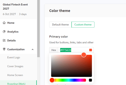
Here you can set up the color theme to go in line with your company branding. The default theme will be selected - which has the Brella Branding color scheme. When you select the custom theme, you will be able to select any color. Add your company colors by the color code or by selecting a shade from the drop-down next to the Primary and Secondary color drop-down fields.
Scroll down and click on save, and Brella will apply the chosen colors. Once you save your event theme color, you can visit next.brella.io to review how components are displayed in the primary and secondary colors selected for your event.
Last updated - July 2023
Written by Purnima Jayasuriya.

If you didn’t find an answer to your questions, please contact the Support Team here.