Learn how to view the meeting request activity before and during the event.
To be covered
Intro
The activity pie chart shows the percentage of meeting request actions (messages exchanged and meeting requests, etc.) that took place before the event, and how many during the event.
Meeting request actions are not similar to meeting requests nor does this metric count chat messages. For each meeting request, multiple actions take place: When it is sent, when it is accepted, when it is rescheduled, when it is canceled, etc.
This is why the numbers in this pie chart do not match with other Engagement or Meeting Request numbers in the Home view.How to read the data
The pie chart indicates meeting activities before the event and meeting activity during the event as a percentage.
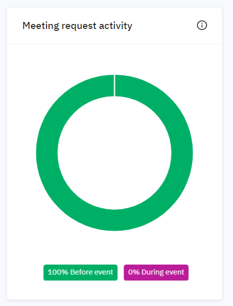
The goal is to have a higher pre-engagement % than during the event.
Why? As participants need to take their time to get acquainted with the platform and other attendees and connect with people before the event starts.
If you can see more and more pre-engagement taking place over several events, it is an indicator that your attendees are increasingly aware that your event is the place to go to set up relevant networking experiences.
If the contrary occurs, then talk with your CSM about how to increase this metric and ensure pre-engagement is addressed in your Communications & engagement plan.
Last updated - July 2023
Written by Yusra Mohideen

If you didn't find an answer to your questions, please get in touch with the Support Team here.
👇